
 |
| photo: Dennis Novak |
Bill Gold 97 yaşında Alzheimer komplikasyonlarından 20 Mayıs 2018’de vefat etti. Birkaç gün önce William Vance’i de yine aynı sebeple yitirmiştik. Alzheimer ciddi bir ölüm sebebi olarak yükselişte belli ki.
Bill Gold afiş
sanatının önemli isimlerinden. 60 yılı aşan bir sanat yaşamı ve 2000’in
üzerinde film. Sinemayla ilgili olanların gördüğünde birkaç afişini mutlaka
hatırlayacakları yığınla klasik film posterinin ardındaki isim.
Jack Kirby, Daniel Clowes, Joseph Barbera gibi pek çok sanatçının yolunun geçtiği Pratt Enstitüsünde öğrenim gördükten
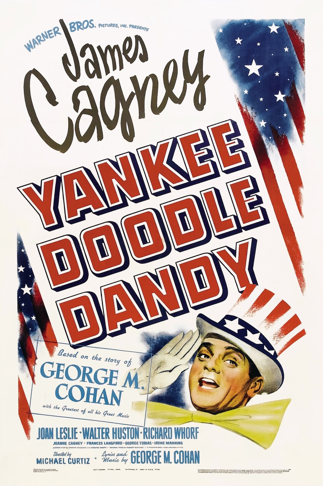
sonra Warner Bros’un New York’taki poster departmanında çalışmaya başlar. İlk
iki çalışması Yankee Doodle Dandy ve
Casablanca. Ardından WW2’ye gider.
Dönüşte bu sefer aynı film şirketinin LA bürosunda görevine devam eder ve WB
reklam bürosunu kapatınca yine New York’ta kendi şirketini kurar ve WB’nin
işlerini yapar. Hitchcock’un 7 filmine afiş tasarlayan Gold’un ilk işi benim de
çok sevdiğim “Rope” filmi olur. Pek
çok klasik filmin afişini yapan Bill Gold, bilhassa uzun yıllar beraber
çalışmaları sonucu Clint Eastwood
filmlerinin çoğunun afişini tasarlamasıyla bilinir. 1971 yılında Dirty Harry
serisiyle başlayan çalışma arkadaşlığı 2011 yılındaki “J. Edgar” filminden sonra emekli olmasına kadar devam eder.


Bill Gold’un
sanatıyla ilgili yorumları:
“I know what movie posters should
look like, instinctively. My style is and has always been less is more. I don’t
like a cluttered look. Clean, simple and to the point”
“My objective is to ‘sell’ the
film, to entice an audience to see it through a revealing and striking image
and typography. To provoke an interest in the ‘story’ of the film is what I am
able to do best”
“Posters illustrations are gone.
They only use digital photos now. Anybody who can use a computer thinks they
can do this. Having computer knowledge is very different from being an artist or
an art director or a marketer”
“I’ve worked on poster campaigns
for films by Alfred Hitchcock, Stanley Kubrick and Federico Fellini, but my
most significant relationship is with Clint Eastwood”
“Years ago, I looked at
everything that MGM and Paramount and all the companies did, and I never liked
anything that I saw. I always found fault with the fact that they showed three
heads of the actors, and that’s about all the concept they would use”
(Exorcist için) “I’d been
specifically told by William Friedkin and Warner Bros that we must not use an
image of the girl possessed, or show anything that had any hint of religious
connotation. They were very concerned about that. Friedkin was very involved,
and he and Warners rejected all our other comps. They knew what they wanted and
certainly picked the right image, which was used all over the world”
“I guess you could say black, red,
gray and white are usually my trademark colors”
“Clint and I have become very
good friends over the years. Professionally, he is as good as it gets. He
appreciates everything I have done for him, and has wonderful taste and a
remarkable eye for art”

“You’d get an assignment and
they’d tell you something of how the movie should be marketed. I’d go see the
film (I always got a kick out of seeing people’s reactions to movies), or if it
wasn’t complete, I’d look at the stills. You then decide how you want the public
to see it, then you think of the best way to communicate that”
(Casablanca için) “My
initial thoughts were to put together a montage showing all the characters
depicted in the film. I wanted to have Humphrey Bogart in the foreground and
Ingrid Bergman behind him looking on. I didn’t want to give away their romance.
The client loved it but said there was no excitement, so I put a gun in
Bogart’s hand.”
(Deliverance için) “The
poster used in the domestic campaign for Deliverance showed hands coming out of
the river holding a rifle. But executives in charge of the international
campaign wanted something a little more dynamic to represent a movie about a
weekend canoe trip from hell. So I thought, wouldn’t it be great if it had a
three-dimensional quality, and it looked like it was coming out of the eye of
one of the southern characters?”
(Rope filmi için) “The
whole trick here was showing Jimmy Stewart holding a piece of rope,” he
explained. “What’s going to happen with that piece of rope? That’s me
instigating the curiosity of the film idea. At first the lettering was very
crisp and casual and typical. And then I felt it needed something to be more
active, something to make it move more, so I added the lines.” And about those
red clouds? “They bring drama to the sky,” he said. “It’s not a settling sky. The
red makes it more imposing.”
(Mystic River için) “I
went to Boston and stayed there for about a month and shot a lot of pictures.”
(Clockwork Orange için) “We
submitted it to Kubrick, and he didn’t like it. He’s got phenomenal taste. But
this didn’t appeal to him. I guess it was too scientific looking. He wanted
more of a flesh-and-blood violence look.”
Hollywood Reporter
dergisinin Gold’a verdiği “sanata adanmış yaşam” ödülünü sunan
Eastwood onun için şunları söyler:
“I dont know what it is that first causes a person to become interested
in a film, whether its the cast or the title or wheher its that first image. I
believe its a combination of all these. Thats the creative part of poster work,
that image and how it affects an audience”

 |
| (kaynak) LA Magazine |
“Bill Gold: Posterworks” (Reel Art Press) kitabı
448s / 950$ (Master Edition). Bir de Deluxe edisyonu var. Kitabın
önsözünü yine Clint Eastwood yazmış. Gün yüzüne çıkmamış tasarımları yanında,
günlüğünden notlar, alternatif versiyonlar, eskizler ve fotoğraflar da içeriyor.
Yayınevi kurucusu Tony Nourmand ile
Bill saatlerce birlikte çalışarak kitabı ortaya çıkarmış.
Kaynaklar


Bu içerik Kuzey Kalesi tarafından hazırlanmıştır.

Hiç yorum yok:
Yorum Gönder
Yorumunuzu yazabilirsiniz.